
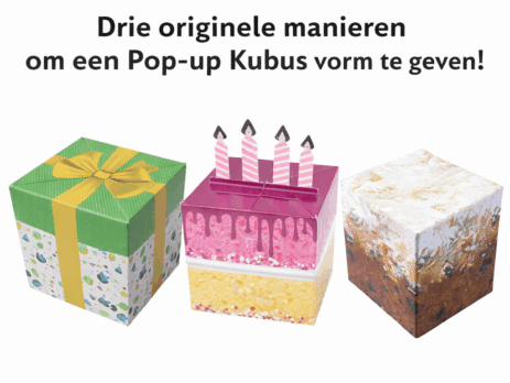
Three original ways to shape a Pop-up Cube!
A Pop-up Cube is in itself an eye-catching direct mail. Folded up, it looks like a compact mailing, but as soon as the recipient opens it, a three-dimensional cube unfolds, grabbing the attention immediately. That very shape offers enormous scope not only to display a message, but also to add meaning. Through clever use of layout, material and story, the cube becomes more than a carrier of information. It becomes an experience!
In this blog, we show you how to format a Pop-up Cube in original ways so that form and message reinforce each other.
—————————————————————————————————————————————————————————————————————————–
The cube as a gift with symbolism
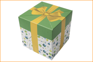
A common but very powerful approach is the cube designed as a gift. Think of a design with a ribbon, bow or gift paper print. This immediately evokes a smile from the recipient. The message feels like something specially wrapped for the recipient.
This approach works particularly well for anniversaries, thank-you moments or milestones. The feeling of being received is central. The content can then connect to that feeling, for example a personal message, an invitation or a symbolic gift. By deliberately presenting the cube as a gift, you give the message extra value without needing extra words.
—————————————————————————————————————————————————————————————————————————–
A festive moment translated into form
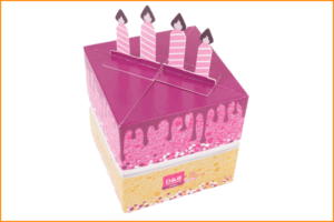
The second design shows how you can literally carry through a theme. Here, the cube is designed like a cake, complete with candles that stick up as soon as the cube opens. The moment of opening thus becomes part of the message.
This Pop-up Cube works as a little party favor. Ideal for birthdays, anniversaries or other milestones. The shape makes it clear at a glance what it is all about, without explanation. The surprise is not only in the pop-up, but in recognising the theme.
—————————————————————————————————————————————————————————————————————————–
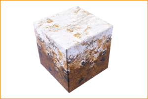
The oliebol as a seasonal surprise
The third design is shaped like an oliebol. A recognisable, typically Dutch symbol that is immediately linked to the end of the year. The icing sugar, texture and warm look make the message immediately clear: this is a seasonal moment.
This Pop-up Cube plays on tradition and recognition. That makes it particularly suitable for end-of-year campaigns, New Year greetings or thank-you moments for customers and relations. The oliebol evokes a feeling of cosiness, completion and looking ahead.
It is precisely because the topic is so recognisable that the mailing feels accessible and human. The message does not have to be grand or complicated. A good wish, a note of thanks or a brief preview is often enough to make an impact.
—————————————————————————————————————————————————————————————————————————–
Design reinforces the message
These three designs show how strongly design contributes to the meaning of a Pop-up Cube. Whether it is about appreciation, a festive moment or a seasonal tradition, the design tells the story even before the text is read. Wondering how your message can be translated into a Pop-up Cube with impact? Discover the possibilities of our direct mail and let design and message make the difference together!